After the tumultuous year that was 2020, we are seeing brands revisit classic design trends. Bold colors and in-your-face marketing has fallen out of favor as consumers seek authenticity and normalcy. Read on as we explore three key trends gaining popularity among major brands and our own clients.
What’s Old is New Again
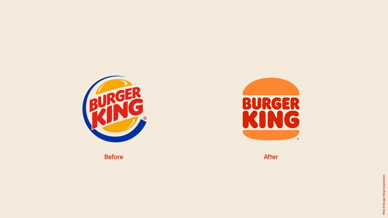
Nostalgia is a powerful selling tool and brands are taking notice. In recent years, major brands have revisited their old branding and updated it with a modern twist, most notably Pizza Hut in 2019 and Burger King earlier this year. Even newer brands are hopping on the nostalgia train, in the past few years the use of “Est.” has surged, appearing in trademarks “at a rate 17 times higher in 2020 than in 1980.” Businesses are trying to capture the feeling of the “good ol’ days”, whether they’re an established burger giant or a new brewery that just moved into town.
The trend has also found its way to marketing campaigns as a whole. Commercials from the 2021 Super Bowl were filled with nostalgic throwbacks including Wayne’s World, Edward Scissorhands, and the 2000 hit, “It Wasn’t Me” by Shaggy.
Experts believe this shift toward the past may be a surprising effect of the pandemic, as consumers sought comfort in the music and movies of their youth. As one psychology professor explained to National Geographic, “Generally, people find comfort in nostalgia during times of loss, anxiety, isolation, or uncertainty.”

Less is More
Minimalism in logo design has been gaining in popularity in recent years as brands abandon complex designs in favor of something more simplified. In an age where we are constantly bombarded with information, be it on our smartphones or on television, a minimalist design gets straight to the point. They’re easy for consumers to process and remember, think of Nike or Apple and you’ll immediately be able to recall their branding.
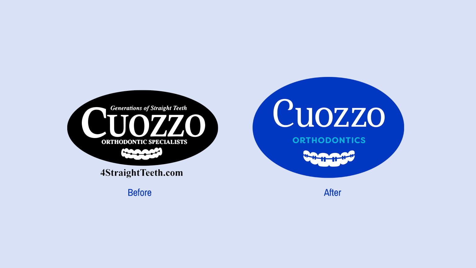
Minimalism itself is an ever-evolving principle, and it doesn’t simply mean removing elements. Simple doesn’t mean devoid of meaning. The key is to keep a single focus and pay attention to the core values of the respective brand. We recently implemented this principle in a logo refresh for Cuozzo Orthodontic Specialists. The client was in need of a modernized logo that stayed true to their previous branding. With Cuozzo, we had three key values to stick to: the legacy of the Cuozzo practice, their dedication to straight teeth, and the friendliness each patient receives every step of the way. In designing the refreshed logo, our Art Director Nick Kiefer stayed with a serif font to preserve the legacy of the existing brand. He curled out the ‘C’ to give it a looser personality and friendly vibe, the rest of the letters remain straight and strong – much like the patented Cuozzo Smile!

Time to Tone it Down
Designers have moved away from using bold, bright colors in favor of incorporating muted pastel colors into their designs. This trend has even made its way to product design, as Apple introduces new pastel iPhones and iMacs. Utilizing a muted color palette allows designers to incorporate brand colors without being overpowering. Your existing brand colors can easily be used as a starting point for the creation of a secondary color palette. One benefit of using a muted color palette is it blends extremely well with text, making it an ideal use on social media as text-based carousel posts rise in popularity.
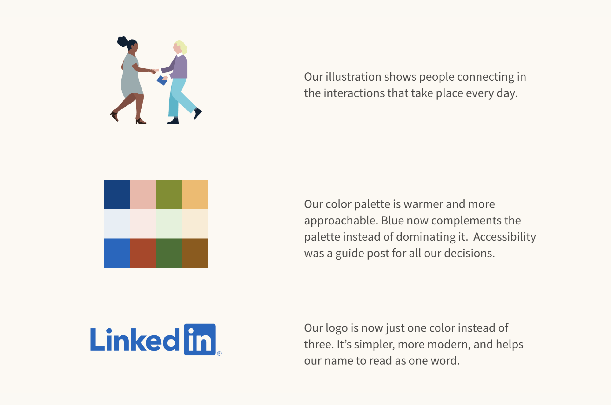
Over the past year, LinkedIn has leaned heavily into this trend, using it as the basis of their updated branding guide. As a result, their marketing across social and landing pages feel more authentic and approachable.

This trend has been particularly popular in the health and wellness space, as muted tones feel natural and organic. Fitness and wellness brand Classpass shares informative information in text-based graphics, all featuring pastel backgrounds. It’s simple and effective and lets the content take center stage.
Think it’s time to refresh your branding or want to completely change things up? We’re here to help. Let’s chat!


